Design principles

Websites are a relatively new media, yet design has been a topic of discussion for at least as long as we have been writing things down. Tastes differ; fashions come and go. Through the back and forth, the principles of design became understood. As a result, some design conventions became time-tested.

Golden rectangleA golden rectangle, a classic Greek proportion, influences design yet today.What we now call the rule of thirds has its origins in the golden ratio noted by the Pythagoreans in 500 BC, 0.618 is about equal to 1/1.618. The ratio was noted again in India in 200 BC in what we now call the Fibonacci number sequence, where each number is the sum of the two preceding numbers. Perhaps the ratio became more than math trivia, became a design convention, because we find it in nature in many sprouts, flowers and leaves. A golden rectangle has proportions of 1 on one side and 0.618 on the other side. In web design, the ratio can inform the following:

Design goals

The first question when designing anything is, what do the users want from product? Like hardcover books, visitors come to websites for the content. Websites communicate through design goals.

  1. Capture attention
  2. Control the viewer's eye
  3. Convey the intended information
  4. Set a tone and evoke an emotion

Design creates interest and focuses interest on the content. Here are some design elements.

Contrast creates visual interest

Variation creates visual interest. The appropriate amount of contrast creates an appealing layout without distractions. Content type determines the appropriate contrast amount. We prefer to read about super heroes in comic books and to read novels in hardcover volumes. Nonfiction, like textbooks with illustrations, fall somewhere in the middle. Because contrast is all too easy to create, subtlety and restraint are characteristics of good design, dazzling flamboyance and useless clutter are not. Contrast can be between the following page elements:

Color for effect and contrast

Color is like pizza. Children prefer plain pizzas and simple colors like red, green and blue. Adults prefer the complex flavors of pizza with many toppings and subtle colors and contrasts. Three standard color schemes are monochromatic, complementary and analogous, which produce different effects and degrees of contrast.

Monochromatic color scheme
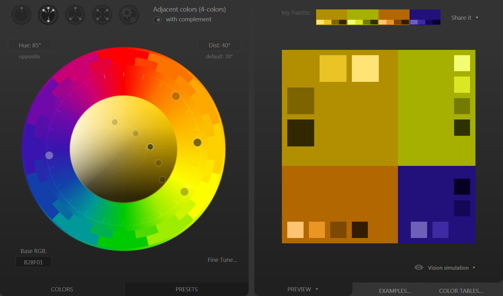
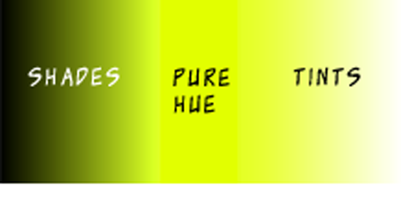
Monochromatic color schemes can be subtle depending on the hue.Monochromatic color schemes use different shades and tints of the same hue. Shades are darker than the pure hue; tints are lighter. Monochromatic schemes create a clean, elegant, authoritative effect. Because difference between hues creates visual interest and there is only one hue in monochromatic schemes, they are low-energy and less visually compelling than multicolor schemes.

Complementary color schemeComplementary color schemes are used on elements intended to capture attention, like a payment button.Complementary color schemes combine two hues from opposite sides of the color wheel (a color wheel is shown below), usually one hue from the warm area and one hue from the cool area of the wheel. Complementary color schemes create maximum contrast and visual appeal. The result is not subtle, but striking and energetic, an effect appropriate in small doses. A dialed-down way to use a complementary scheme is to make one hue dominant, like a monochromatic scheme, with the second hue used only for accents or buttons.

Analogous color schemeAnalogous color schemes create a moderate amount of contrast and a natural, nuanced effect.Analogous color schemes, often found in nature, use colors from the same side of the color wheel, usually all from the warm side or all from the cool side of the wheel. Like a stand of trees with their leaves turning color in the fall, the effect is both rich and subtle. The contrasting hues create more visual interest than a monochromatic system but less than a complementary scheme, a moderate course for contrast.

Color design resources

Valid ways to select colors vary from sampling colors approximate to the desired scheme from a photograph to working out the math with precision. The color scheme on the Hardcover website relied on math and the Paletton Live Colorizer.

Paletton Live Colorizer

The Hardcover website uses analogous colors, the main color used for the logo, the complementary of the main color used for text links, as shown above. A similar website is Adobe Color.

Color gradients add contrast

Like analogous color schemes look natural because they mimic nature, a gradient between the hues on both sides near a chosen color, again as is common in nature, creates a more nuanced appearance and adds contrast for more visual interest. Both the Donate button above and the color gradients on Hardcover website are examples.

While contrast is a straightforward concept, color is a complex and contentious subject. There are competing methods of explaining color and ways to put together color schemes. Perhaps, without being able to put into words, you find a color scheme you think will be suitable for your website. Try it on the website to see if it works. If it does, then do not explain yourself. Regarding color, you will not be the first.

Font conventions

Unlike print designers, web designers have little control of fonts. Even as the situation has improved in what the server can present, many client devices prefer to ignore the requested fonts. The only sure way to have a font look as intended on all devices is to put the font in an image, which is appropriate for logos and image text. Most of the time, less control is adequate. Design conventions for fonts are long-established.

Serif fontSerifs are the feet at the tips of traditional fonts. Collectively the outside serif edges reinforce a visual line at the top and bottom of each row of text. The visual line makes it easier for the eye to skim along the row of text. Because serif fonts are easier to read than other fonts, by convention serif fonts are used for bodies of text. However, until recently serifs have been difficult to produce on computer screens, which has led some people to believe serif fonts are out of fashion. Yet as displays have improved, serif fonts are finding their way to websites.

Sans serif fontSans serif fonts, literally without serif, are common in headings and navigation in order to provide contrast with the serif body text. Initially in computers, sans serif fonts were used for everything because they were easier for screens to display, a decision not based on design principles.

Fixed width fontFixed-width fonts were developed for mechanical typewriters. The design was a mechanical necessity, again, not a design decision. Although mechanical typewriters are obsolete, fixed-width fonts are still with us for lining up rows of numbers and other information made more clear when vertically aligned.

Legibility

An established print convention for ease of reading is to put between sixty and sixty-five characters on a line. Studies on the web have determined the best font size is eighteen pixels. These two findings work together for the best reading speed and comprehension. As the space between lines is increased, more characters can be on a line. With a wide line spacing as many as ninety characters still tests well, but as line space increases, the total amount of text on the screen reduces, so a more-moderate number is usually chosen.

While page elements often adjust to the screen size, line spacing should be fixed and characters per line should be set to flex only as far as a maximum number based on the line spacing.

Unity for focus and usability

Unity is a consistent, site-wide pattern for page layout, color scheme, typography and the style of images and illustrations. Unity removes distractions that muddle focus on the content and improves the website's usability.

Images and illustrations

Images and illustrations make contrast and visual interest by breaking up the text. Unfortunately, that is their only function on many websites. When used appropriately, images add information and create a tone. A picture really can be worth a thousand words.

Photographs are easy to add to a website. More work than photos, drawings and illustrations increase the production value of a website. Clip art has the opposite effect and is to be avoided.

Infographics, or information presented graphically, is the paradigm of functional images. With communication as the goal, diagrams, charts, maps and timelines can be the most useful images.

As a matter of capturing interest, images and illustrations should be unique to the website. The best source might be to take the photo or sketch the artwork yourself. Alternatively, hire someone to produce unique images. Only as a last resort, digital stock websites sell images, which will not be unique.

Common web design errors

Because quick and accurate communication is the purpose of design, a design error is anything that:

Here is a short list of common design errors.